Brand Guidelines Refresh
Context
As Krisp's brand usage grew across product, marketing, sales, and web, the existing guidelines needed to stay clear, practical, and easier to apply in daily work.
The refresh was not only about updating visuals. It was about making sure the brand system matched how teams were actually using it.
My part
I worked on the guideline refresh with Sevada Ghazaryan, from identifying what needed to change to preparing updates and reviewing them with the teams involved.
The work included typography updates, clearer usage rules, gradient guidance for product needs, and a new visual layer using grain and texture.
We also presented the updates to product and marketing teams, gathered feedback, and followed the process through to final approval for company-wide use.

Cover refresh
The guideline document was updated to match the current brand direction and make the system easier to use.
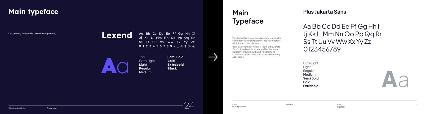
Typography update
The type system moved from Lexend to Plus Jakarta Sans, with clearer hierarchy and usage guidance.
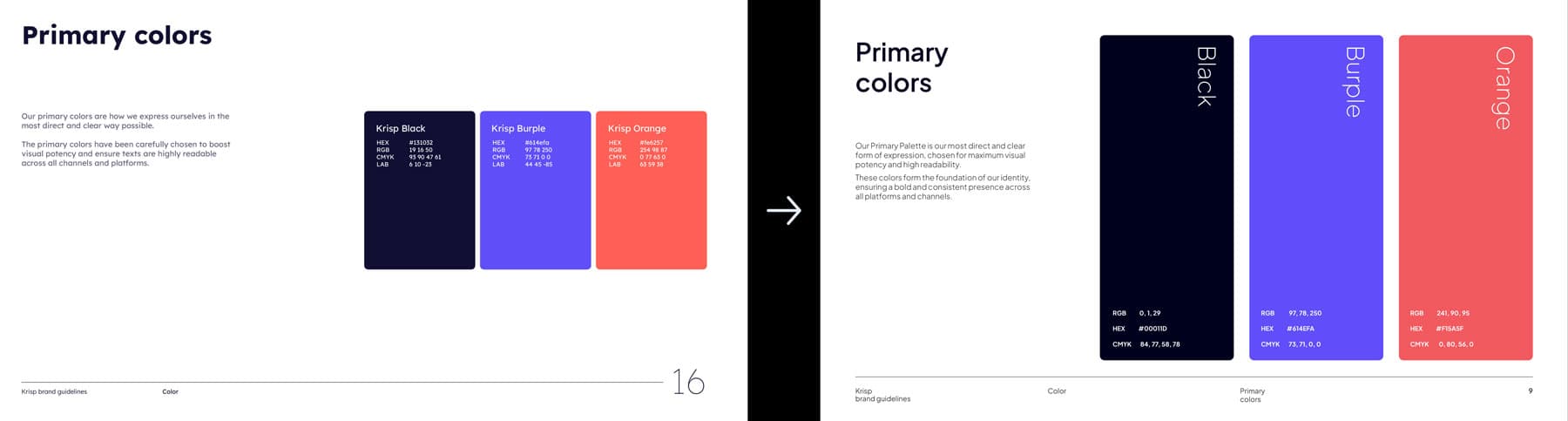
Primary color documentation
The core palette stayed familiar, but the documentation became clearer and easier to apply.
New visual guidance
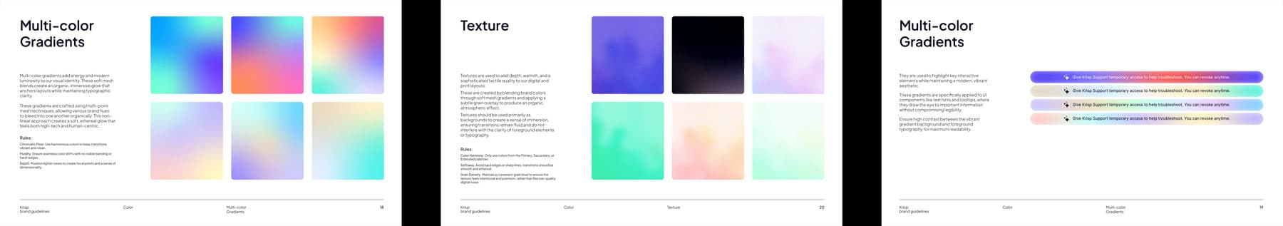
Gradient and texture guidance
New gradient and grain rules were added to support product, marketing, and web applications.
What changed
Teams had a clearer reference point for using the brand. The updated guidelines made visual decisions easier to align across product, marketing, sales, and web materials.